The Psychology of Colour: Choosing Winning Designs for Custom Sports Uniforms
When your team steps onto the field, the first thing opponents notice isn’t your strategy — it’s your colors.
From the red of determination to the black of dominance, color psychology plays a powerful role in how teams perform and how others perceive them.
Across Canada, schools, leagues, and clubs are realizing that choosing the right colors for their custom sports uniforms is about more than aesthetics — it’s about creating a winning identity that fuels confidence, unity, and performance.
At Sports Uniforms Canada, we’ve helped hundreds of teams craft jerseys that don’t just look good — they feel right. Here’s how the psychology of color can shape your next championship look.
What Your Team Colours Say About You
Every color carries meaning — influencing emotion, focus, and energy levels.
In sports, these subconscious signals can impact both player mindset and opponent perception.
Let’s break down what your team’s color might be saying.
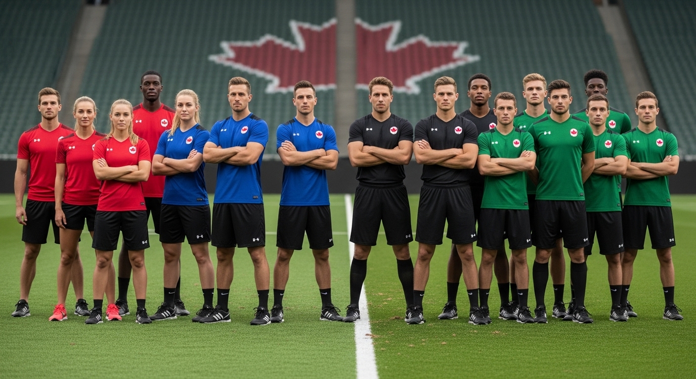
🔴 Red — Power, Passion, and Intensity
Red is one of the most popular colors in Canadian sports — and for good reason.
It symbolizes energy, aggression, and competitive spirit.
Teams in red are often seen as dominant and fiery — think of it as the color of motion and motivation.
It’s perfect for high-energy sports like soccer, basketball, and hockey, where adrenaline and momentum drive performance.
Pro tip: Pair red with black or white to balance boldness with clarity — creating a timeless, confident look.
⚫ Black — Strength, Focus, and Authority
Black represents control, discipline, and intimidation.
It gives teams a sleek, professional edge — and research shows opponents often perceive teams in black as more aggressive and serious.
That’s why so many elite-level teams integrate black accents or full-black kits into their design.
Design idea: Combine matte black with subtle gradients or metallic trims for a premium, modern aesthetic.
🔵 Blue — Calm, Trust, and Strategy
Blue uniforms project confidence and composure.
They’re associated with focus and teamwork — ideal for teams that rely on discipline, planning, and tactical execution.
Lighter blues bring a sense of openness and creativity, while darker shades (navy, royal) suggest strength and consistency.
Common in: Volleyball, baseball, and academy programs where teamwork and coordination define success.
🟢 Green — Balance, Growth, and Resilience
Green connects with nature, renewal, and endurance.
It’s energizing without being overly aggressive — perfect for outdoor sports and programs focused on development and growth.
Design note: Emerald or forest green combined with gold or white adds a traditional yet inspiring look.
⚪ White — Purity, Unity, and Freshness
White symbolizes integrity and teamwork.
It’s often used in contrast with other bold colors to represent a “fresh start” or balance within a team.
White is especially popular for away kits or multi-sport schools aiming for clean, consistent branding.
Pro tip: Add subtle sublimation patterns or gradient textures to prevent plainness while maintaining simplicity.
🟣 Purple — Creativity, Pride, and Individuality
Purple is bold, rare, and instantly distinctive.
It represents confidence and uniqueness, great for clubs that want to stand out.
Teams using purple often combine it with gold, silver, or white for a royal and polished feel.
Used by: Cheerleading squads, basketball clubs, and artistic or community-oriented teams.
🟡 Yellow / Gold — Optimism, Speed, and Energy
Yellow embodies enthusiasm and positivity.
It’s a color that draws attention — energetic, fast, and full of motion.
Paired with black or navy, it creates a bold, memorable look that shines under lights and in photos.
Ideal for: Track & field, soccer academies, and high-visibility teams that want to radiate energy.
Colour Combinations That Win in Canadian Sports
Choosing the right primary color is only half the story — successful uniforms rely on smart color pairing and contrast that balance style with readability.
Here are some of the most effective and popular Canadian team color combinations today:
1. Red, Black, and White — The Champion’s Trio
The combination of red for passion, black for strength, and white for unity creates the perfect balance of energy and discipline.
This timeless palette is bold, aggressive, and highly recognizable — which is why it’s Sports Uniforms Canada’s signature scheme.
2. Blue and Silver — Modern and Strategic
This combo feels sharp and intelligent — symbolizing confidence and composure.
Silver metallic accents give blue-based jerseys a premium, futuristic appeal.
Popular among hockey and basketball teams across Ontario and B.C.
3. Green and Gold — Heritage and Growth
Rooted in tradition, this mix feels classic yet powerful.
Green adds freshness, while gold injects energy and leadership — ideal for rugby, soccer, or school leagues.
4. Black and Gold — Power and Prestige
Once reserved for elite teams, black and gold have become a go-to for semi-pro clubs aiming for a professional look.
This pairing communicates dominance and excellence — striking both in person and on camera.
5. Navy and Red — Bold and Balanced
A strong mix of authority (navy) and passion (red) — representing controlled intensity.
It’s a standout choice for teams that value both tradition and modern design.
Design Insight: Contrast Matters
Beyond color choice, readability and visibility are crucial.
Numbers and names should always contrast clearly against the base color — not just for aesthetics but for practical gameplay visibility.
Our design team tests every combination to ensure legibility on the field and in photos.
How Sports Uniforms Canada Helps You Design Like a Pro
Choosing colors can feel overwhelming — but that’s where we come in.
At Sports Uniforms Canada, we merge sports psychology, professional design, and performance engineering to build uniforms that look powerful and feel comfortable.
1. Free Design Consultation
We start every project with a free color and design consultation.
Tell us about your sport, values, and goals — we’ll recommend the perfect color palette and layout to match your team identity.
2. 3D Mockups with Realistic Color Visualization
Our digital mockups show how colors look in real lighting and gameplay conditions.
You can preview different combinations, tweak designs, and approve everything before production starts.
3. Expert Fabric Matching
We ensure your colors print accurately on the chosen fabric — because color tones can appear slightly different across materials.
Our sublimation technology locks colors into the fibers for fade-proof vibrancy all season long.
4. Consistency Across All Apparel
Your team identity shouldn’t stop at jerseys.
We replicate your exact color palette across shorts, socks, hoodies, tracksuits, and bags — ensuring total uniformity from head to toe.
5. Canadian Craftsmanship, Fast Delivery
All our production happens in Canada — guaranteeing faster turnaround (2–3 weeks) and consistent quality every time.
From schools to professional leagues, teams trust us for durable, high-performance apparel that stands out.
Final Whistle: Colour Your Game with Confidence
The colors your team wears don’t just tell people who you are — they influence how you play.
A well-designed uniform powered by color psychology can build confidence, inspire energy, and create a strong team identity that lasts for seasons.
At Sports Uniforms Canada, we don’t just make uniforms — we design symbols of pride, passion, and purpose.
Because when you wear your colors with confidence, you’re already one step closer to victory.
⚡ Design Your Winning Colours Today
📩 Email: info@sportsuniformscanada.com
🌐 Website: www.sportsuniformscanada.com
📸 Instagram: @sportsuniformscanada
🚚 Free Design Mockups | 2–3 Week Delivery | Kits from $35


